The case study is either on-going or getting ready.
You should be able to see it in a few days!
The case study is either on-going or getting ready. You should be able to see it in a few days!
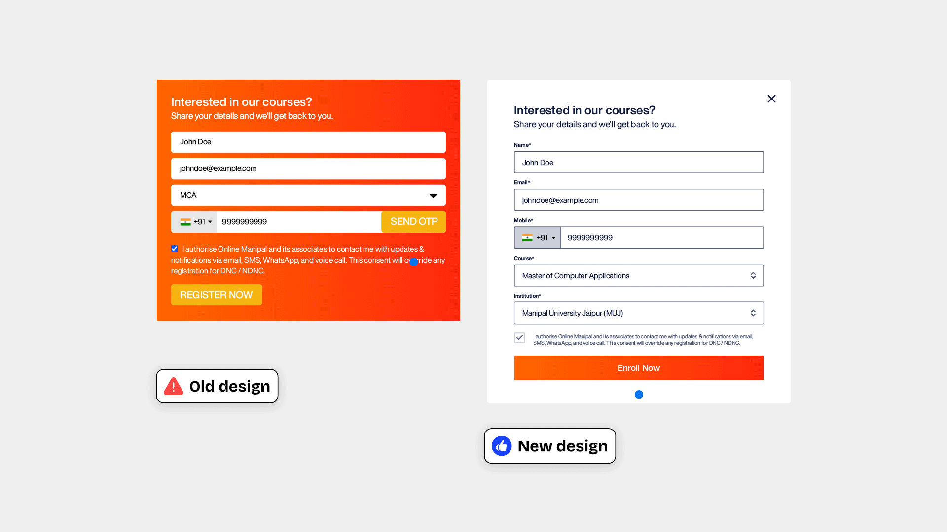
In the age of one tap login and autofills, having a long form naturally upsets the users. However to meet business and legal requirements a form with atleast four fields was necessary for Online Manipal. So, it was essential to make the experience of the form as smooth and comfortable as possible. In this case study I'll be going through a number of improvements and enhancements that we implemented with design to make the form filling experience as comfortable as possible.
Problem: In the old design on clicking the CTA the page was scrolling to the form. And to add to misery there was no scrolling animation which often caused confusions as the users didn't understand which part of the page they were in and it led to them skipping some essential content, leading to an overall unpleasant experience.
Solution: Instead of a scroll we designed a form that opens as a pop-up. This form gives the users a clear idea of what is happening and also gives them the freedom to use the form when the wish to fill.
Result: Although the new form saw a lot of clicks on the pop-up close button, but when tested simultaneously with the older format, the new form showed significant improvement in conversions.
Problem: The old design had only one field for courses where all the courses were listed in a dropdown segregated by universities. As the number of courses grew, the list became longer, increasing confusion among the learners to choose a desired course. Moreover, similar courses were offered from different universities which added to an already confusing list.
Solution: A new field was introduced called institution. Now the learners only need to choose a course from the first dropdown list and the institution offering the course appears in the next dropdown. If a course is offered by only one institution the second field gets auto-filled.
As the learners are more confident about the course they want to pursue, reducing the number of choices in the course field helps them choose their desired course better. And once they have chosen a course then they can compare between the universities the courses are being offered from.
Problem: The old design had a ‘Send OTP’ button beside the phone number field. The learners often clicked on the final submit button without clicking on Send OTP and it would result in the form throwing an error and drop offs.
Solution: In the new design the OTP has been moved to a different screen after clicking on the ‘Enroll Now’ button which helps the users not miss the OTP option anymore and prevents errors.
From a business point of view a partial lead can be captured even if the user does not verify with the OTP. These leads are stored in a separate database and are sent soft nudges if the details entered are correct.
Problem: The old design always had the submit button active, which led to a lot of users click on it without filling all the fields. The form would then through an error for one field at a time. This led to a lot of drops from the form.
Solution: In the new designs the submit button was disabled that gave the users a visual cue that they can proceed only after all the fields are filled.
After a user has put in efforts in taking some actions a visual change often gives a positive nudge to go for the next step.
A number of design fixes were made in order improve the usability of the form
The old form used to go into a disabled state when backend processes were taking place. In the new design we introcued loader animations during these processes.
Background: When backend processes are taking place a loader animation gives users assurance that their actions have been recognised and help them anticipate the next step. It also gives them a sense of progress and reduces uncertainity which helps make the wait time less upsetting.
This is specific case for returning users, where we addressed the experience of a user who was trying to submit the lead form more than once. There is a massive number of users who fall into this category for a number of reasons like trying to opt for a different course, trying to access their application, etc.
Problem: As Online Manipal is the first touch-point of the users where they enroll for a course, they often tend to remember and visit Online Manipal more when they want to login to their accounts. However, the old form used to throw an error to returning users saying their details already exists and giving a very small visual cue of the login link with the error message. This lead to massive drops and learners abandoning their applications.
Solution: The error message was replaced by a screen, where instead of saying "Your deatil already exists", the form showed a more personalised message for the effort the user has put in, saying "Hey [username], we have your application ready with us", followed by their course details and a very prominent log in button.