The case study is either on-going or getting ready.
You should be able to see it in a few days!
The case study is either on-going or getting ready. You should be able to see it in a few days!
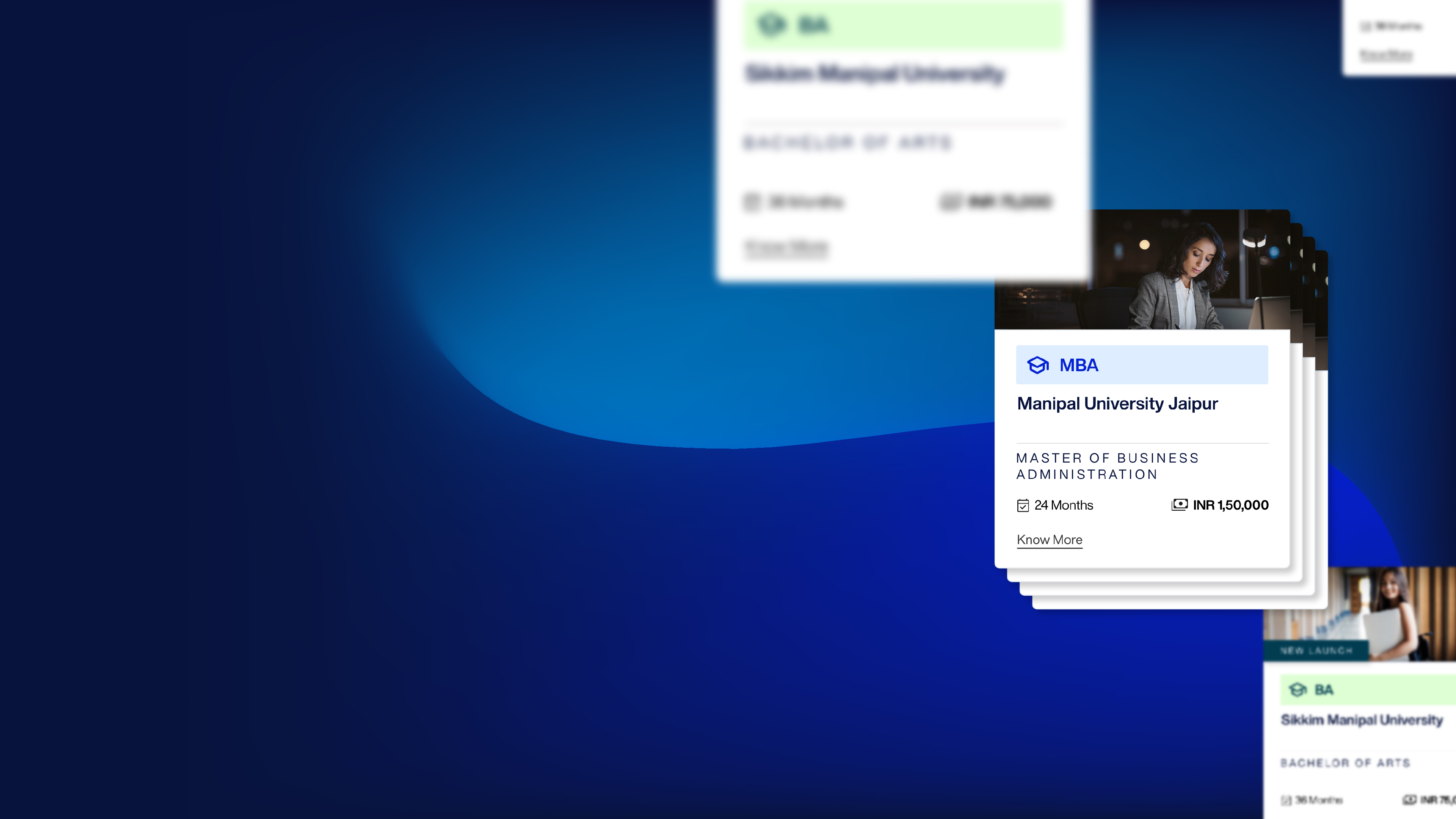
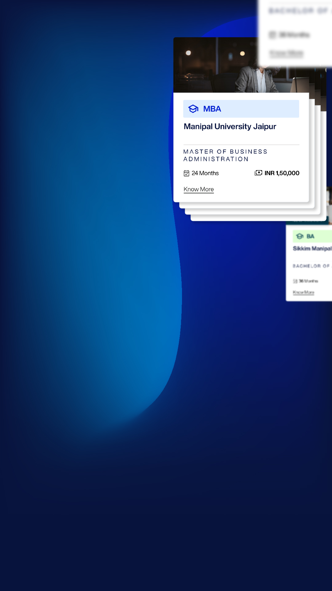
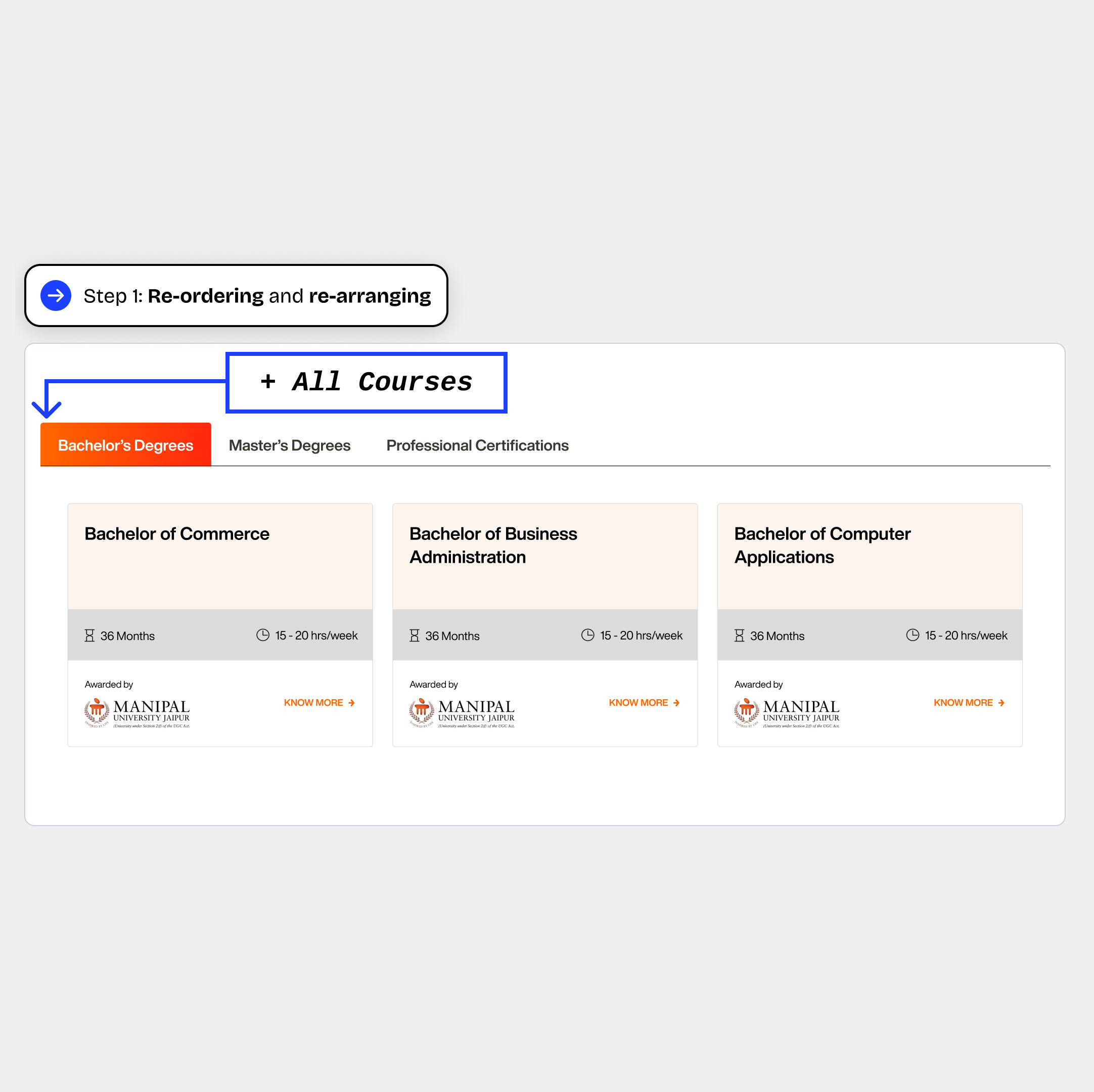
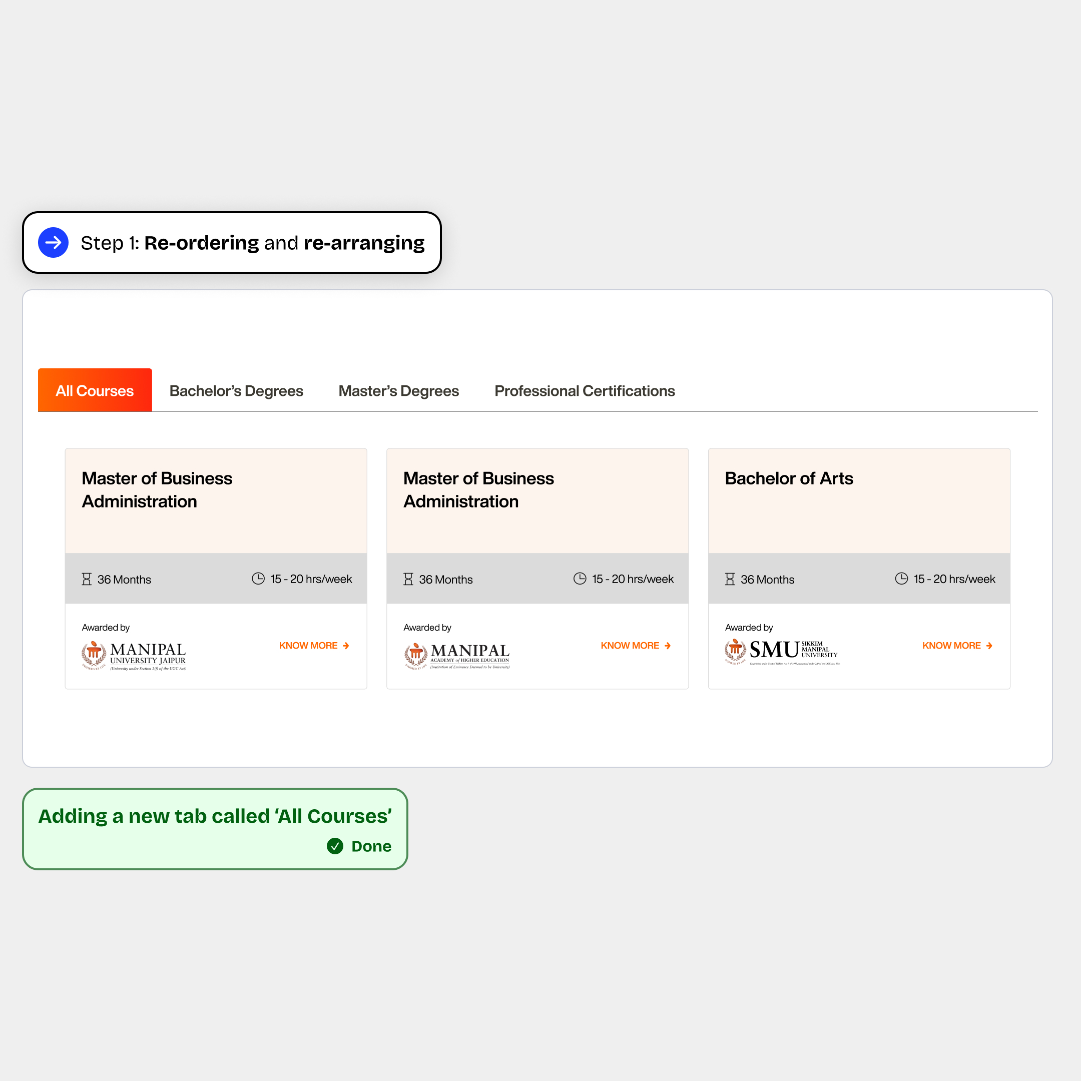
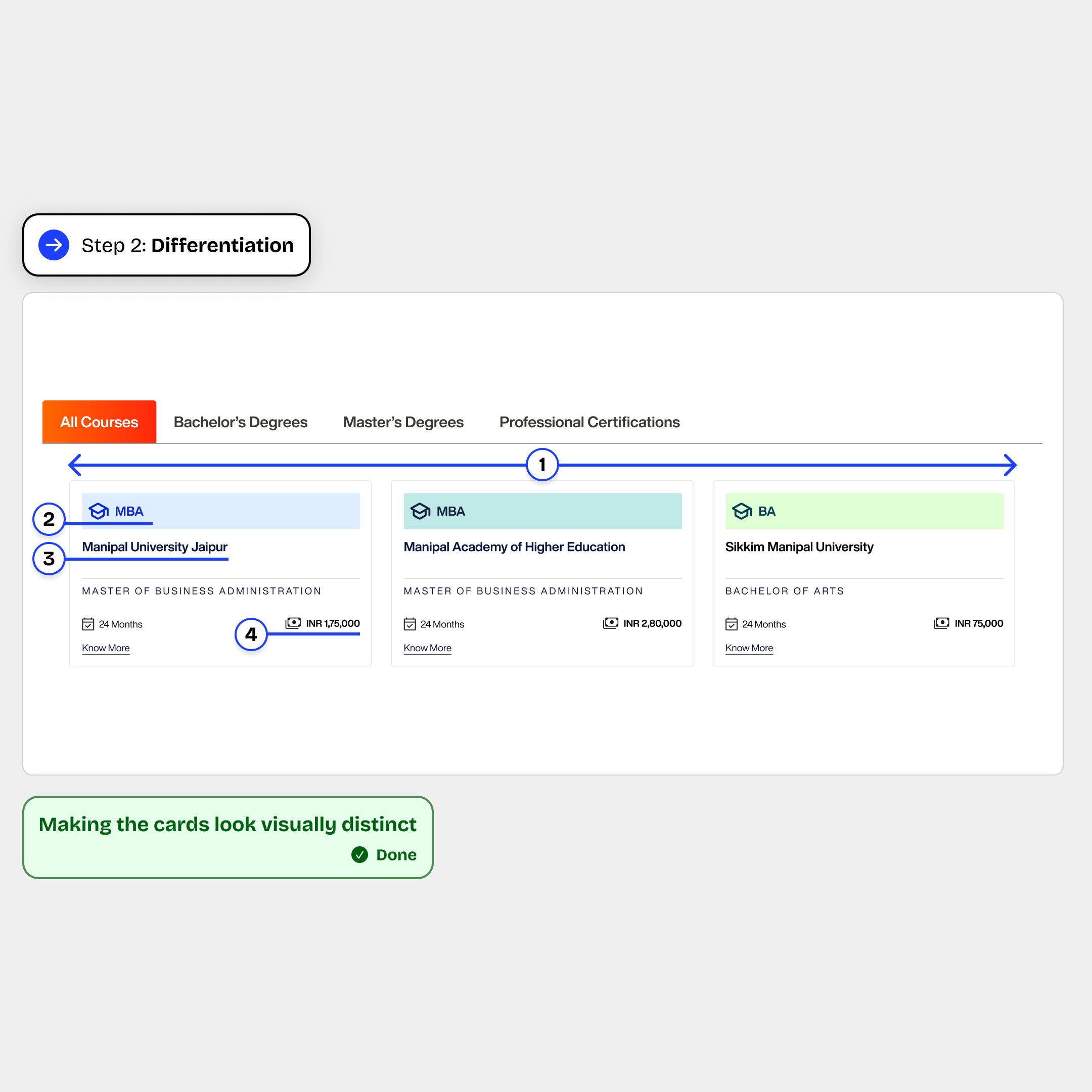
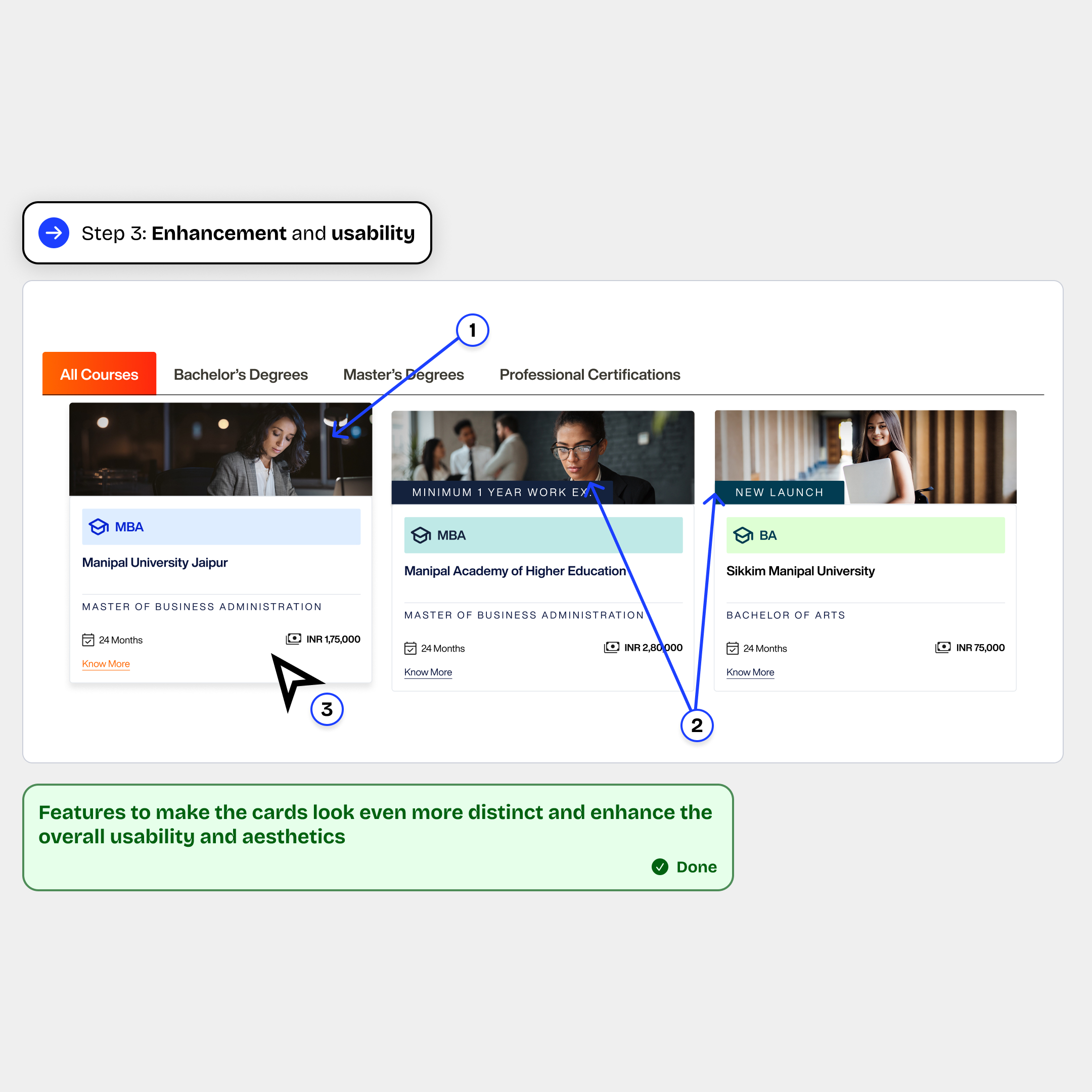
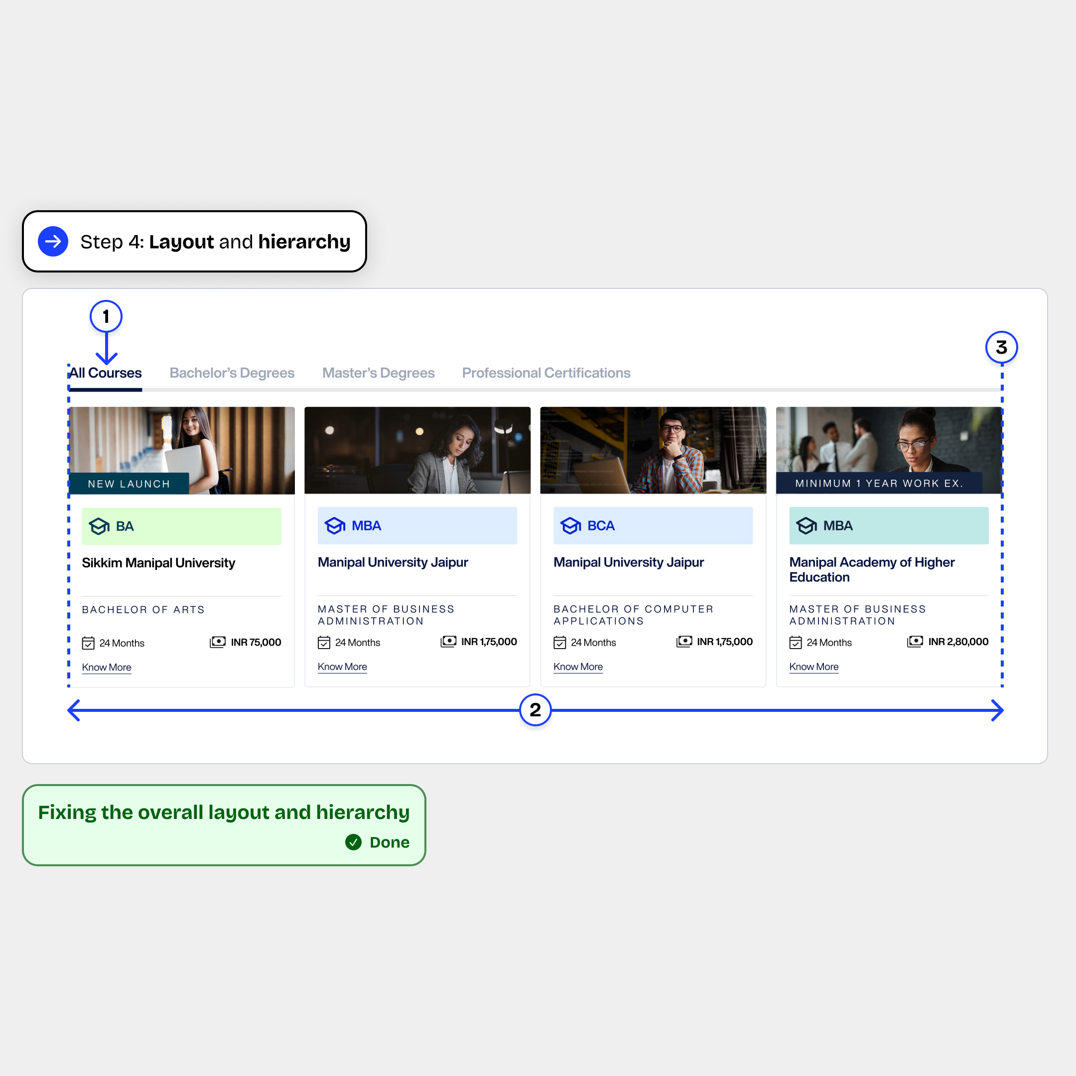
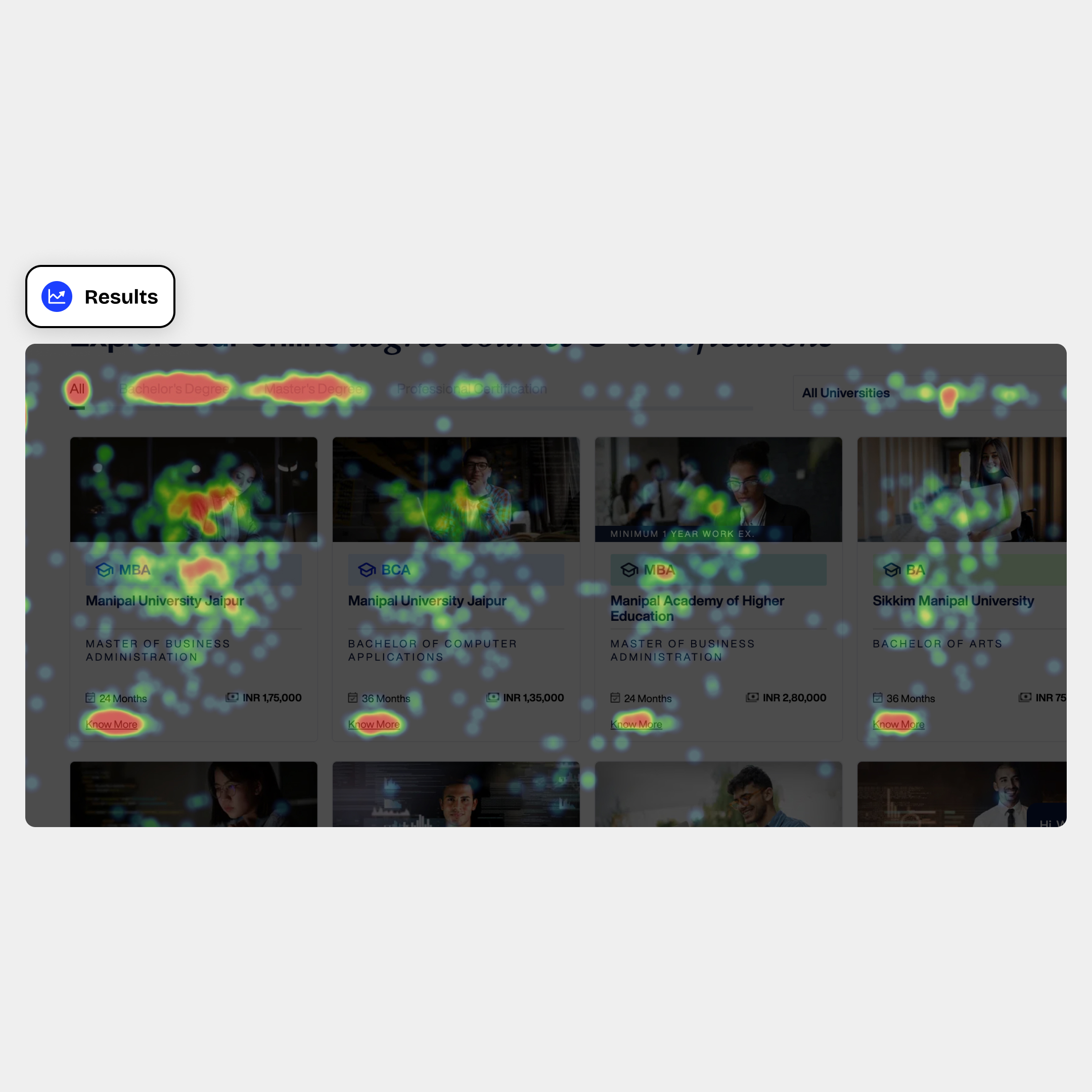
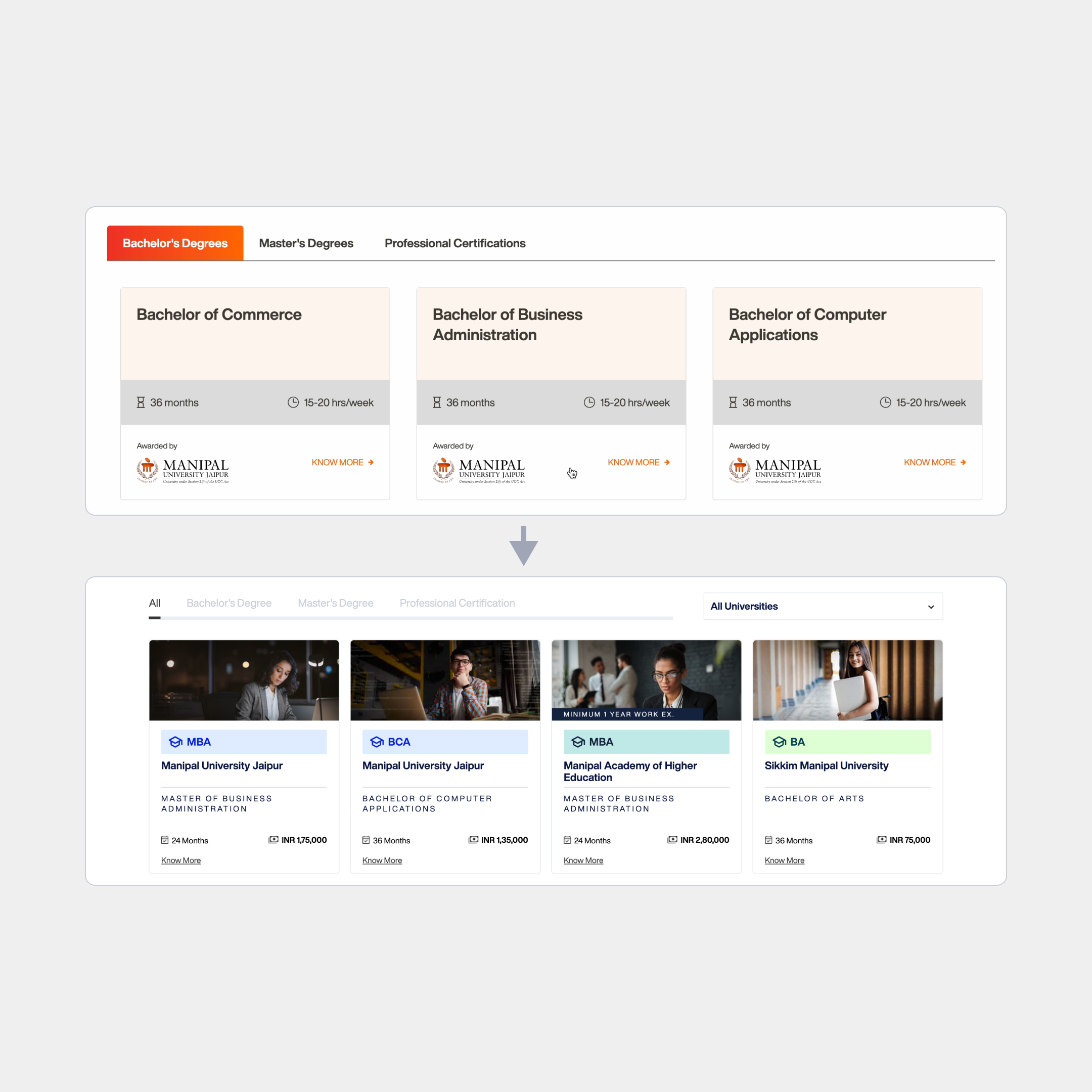
Course cards are the first decision making touch-point for any student visiting the Online Manipal website. So, it’s important for the course cards to look visually distinct and help a student make decision for choosing a course
The course cards were looking too similar as all the Manipal Universities have similar logo.
The students recognised the courses better with the abbreviations (but full course names were used for these cards).
Only the ‘Know More’ link was clickable but the students were clicking on the entire card (as one would expect a card to behave); and
Important details like fees, work experience were not shown in the card
Next step: re-ordering and re-arranging
At this point all the courses were of Manipal University Jaipur and the most popular course MBA was not visible on page load.
Now we can see courses from other universities and MBA is also visible on page load
Next step: making the cards look visually distinct
Colour coding the cards (based on universities) for visual differentiation
Using abbreviations instead of the full course names, as they were better recognised.
Using university names instead of the logos
Highlighting ‘Fee’ instead of ‘hrs/week’ as fees are more crucial while choosing a course
Now we can clearly see the difference between the two MBA’s offered (university & price)
Next step: features to make the cards look even more distinct and enhance the overall usability and aesthetics.
Using an image with a persona makes it easier for students to understand who the course is for and makes the card look more appealing.
Additional tags to give more insights about the courses like "New Launch" and "Work Ex.".
Making the entire card clickable and adding a hover animation to denote the same.
Every feature contributes to making the cards more and more unique and helps a student visiting the website choose a course more easily.
Next step: fixing the overall layout and hierarchy
Removing unnecessary highlights (the gradient background) on the tabs so the focus remains on the course cards.
The cards were made more compact in order to fit more cards and showcase more courses.
Overall alignment of the section fixed (tabs and the edge of the first and last card in a row).
Heatmap shows a signficant amount of impressions on the course cards. People are tapping/clicking mostly on the 'Know More' button but there is a significant amount of impression on the other parts of the card too.